Accessories
Wedding Tie Color Coordination: Matching the Palette
How to tie his tie to the wedding palette and his groomsmen — tonal versus contrast, the seasons, and the one rule about the pocket square — without dead-matching a single thing.
Anchor his tie to the wedding palette, not the suit swatch. Go tonal for safe harmony or a muted complement for impact; separate the groom from his men by depth, form, or texture; let the pocket square echo the tie rather than twin it; and let the season set how warm the color runs.
His tie is the single most photographed accent he will wear all day. It sits at the center of his chest in every portrait, every first look, every toast. And yet it is the piece most grooms get slightly wrong — usually by trying too hard to match. The instinct is to buy a tie in the exact color of the bridesmaid dresses, or the exact shade of his suit, and call it coordinated. The result reads stiff, a little like prom, and rarely photographs the way it looked on the hanger. Coordinating well is quieter than that, and the rules are forgiving once you understand what the tie is actually for.
How should his tie relate to the wedding color palette?
Start with the right anchor. The suit is the foundation of the look; the tie is the accent that connects him to the day. So the tie should take its cue from the palette — the colors already living in the bridesmaids' dresses, the florals, the linens, the invitations — rather than from the suit fabric. The Tie Bar frames it plainly: harmonize the tie color with the overall scheme, so if the party and flowers run sage, you choose ties in warm green tones.
The trap is the dead-match — sourcing a tie in the literal swatch of the bridesmaid fabric. Dyes drift between materials; silk and rayon and chiffon rarely read identically under a camera flash, and a too-exact match looks bought-to-order rather than chosen. The better move is to step one shade away — a tie a little deeper or a little softer than the palette color — so it reads as a considered echo. That single degree of separation is the difference between "matched" and "composed."
Tonal or contrast — which approach should he take?
There are two honest ways to coordinate a tie to a scheme, and both work when handled with restraint.
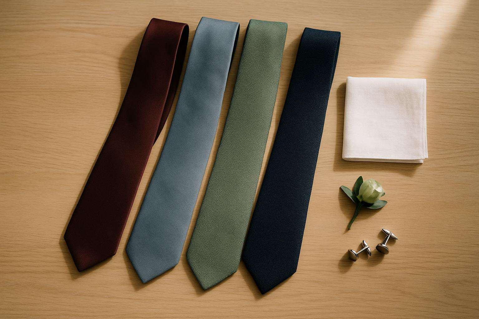
Tonal keeps the tie in the same color family as the palette: a sage scheme accented by a forest or olive tie, a dusty-blue scheme by a navy tie. It is the safe, cohesive choice and it photographs as harmony. Controlled contrast puts the tie opposite the palette on the color wheel but in a muted register — a dusty-blue palette lifted by a soft rust or terracotta tie. Contrast carries more impact, but it must stay muted. The collisions to avoid are the loud primary clashes: a bright blue tie against orange accents, or a purple tie against red. Those read as a mistake rather than a choice. When in doubt, tonal never fails; save contrast for when the palette genuinely invites it.
How does his tie separate him from the groomsmen?
The tie has two jobs at once: the men should look like a unified group, and the groom should be instantly findable in the photographs. Three patterns deliver both, and you can read them at a glance.
| Pattern | How it works | Best for |
|---|---|---|
| Same family, groom darker | Groomsmen in a lighter version (light blue); groom in the saturated anchor (navy) | Classic, foolproof, reads as hierarchy |
| Same color, different form | All one hue; groom switches the shape — a bow tie, or a knit/grenadine texture against their plain silk | Black-tie and formal weddings |
| Muted complement | Groom in burgundy, men in blush; groom in navy, men in dusty blue | Color-forward, modern palettes |
A fourth, increasingly popular option is the mixed groomsmen — each man in a slightly different but related tie. Done with discipline it reads as curated personality; the rule is that every tie shares one through-line color or tone. Whatever the pattern, order the whole party's ties from one retailer in a single batch. Even the drift between bright white and off-white looks unintentional once eight men stand in a row.
Should the tie match the pocket square?
No — and trying to is the most common chest-level error. The near-universal rule from menswear writers is complement, don't twin. The pocket square should pick up one color from the tie in a different shade, pattern, or texture, or sit in a contrasting accent color entirely. He Spoke Style warns that a too-exact tie-and-square match reads as costume rather than ceremony, and OTAA echoes that the square should echo a hue in the tie, never the whole of it.
The default that never fails — across black-tie, garden, and everything between — is a plain white linen or cotton square in a flat presidential fold. It adds light to the chest without competing. If his tie is bold or patterned, keep the square plain; if the boutonnière is loud, keep the square neutral, so the chest never becomes busy. Weddings allow a touch more coordination than everyday dress, but the principle holds: the square is a supporting note, not a second tie.
How do season, fabric, and width factor in?
Season sets the warmth of the color. Spring and summer favor lighter, airier tones — sage, dusty blue, tan, soft terracotta — often in linen or cotton-blend for garden and beach settings. Fall and winter call for deeper, warmer tones — burgundy and wine, rust, deep plum, charcoal — usually in silk or wool. The palette still leads, but match the register of the color to the light of the day.
Fabric quietly changes how a color photographs. Silk and grenadine carry a subtle sheen that reads formal; matte microfiber, cotton-blend, and knit ties read casual and photograph cleaner under harsh light. For a formal wedding, choose silk with a touch of sheen rather than a knit, which can look too relaxed beside a tuxedo. Finally, the width should suit his frame and his lapel — a traditional 3.25 to 3.5-inch blade for most men, a slimmer 2.5 to 3-inch for narrow frames or modern slim suits. An ultra-skinny tie against a wide peak lapel reads as a mismatch, no matter how good the color.
Coordinate the tie this way and it stops being a thing he worries about. It simply belongs — the right color, in the right register, separating him gently from his men and echoing the day around him. That is the whole job of the tie, and it is an easy one to get right.
Frequently asked
Should the groom's tie match the suit or the wedding colors?
The wedding colors, not the suit. The suit is the foundation; the tie is the accent that ties him into the day's palette — the bridesmaids' dresses, the florals, the linens. Choose a tie that picks up one of those palette colors, in a shade slightly deeper or softer than the literal fabric, so it reads intentional rather than purchased to match. As The Tie Bar puts it, harmonize the tie color with the overall scheme — if the party and flowers are sage, choose ties in warm green tones. Avoid dead-matching the suit swatch; matching the palette is what makes the look feel composed in the photographs.
How does the groom's tie stand out from the groomsmen's?
Three reliable patterns. First, same color family with the groom darker or richer — groomsmen in light blue, groom in saturated navy, so the eye lands on him. Second, same color but a different form — a bow tie or a knit/grenadine texture where the men wear plain long ties. Third, a muted complement — groom in burgundy, groomsmen in blush. Each keeps the group unified while making the groom findable in a lineup. The one thing to avoid is having the groom dress identically to eight men in the same tie, which erases him in the photos.
Does the tie have to match the pocket square exactly?
No — and matching them exactly is the most common groom mistake. The rule across menswear writers is complement, don't twin: the pocket square should echo one color from the tie in a different shade, pattern, or texture, or sit in a contrasting accent. He Spoke Style notes a too-exact match reads as costume rather than ceremony. The safe default that works for any dress code is a plain white linen or cotton square in a flat presidential fold — it adds light to the chest without competing with the tie or the boutonnière.
What tie colors work for each season?
Let the season set the warmth of the color. Spring and summer favor lighter, airier tones — sage green, dusty blue, tan, soft terracotta — often in linen or cotton-blend for garden and beach settings. Fall and winter favor deeper, warmer tones — burgundy and wine, rust, deep plum, charcoal — usually in silk or wool. The palette still comes first, but a heavy oxblood tie can feel out of place at a bright June garden ceremony, just as a pale pastel can look thin against an autumn evening. Match the register of the color to the light of the day.
Does tie fabric change how the color looks?
Yes, more than most grooms expect. The same color reads differently across fabrics. One-hundred-percent silk and grenadine carry a subtle sheen that photographs formal; matte microfiber, cotton-blend, and knit ties read more casual and photograph cleaner under harsh or direct light. For a formal or black-tie-adjacent wedding, choose silk with a touch of sheen rather than a knit, which can look too relaxed beside a tuxedo. For a relaxed daytime or outdoor wedding, a matte cotton-blend or knit feels natural and avoids glare in the photographs.
Can the groomsmen all wear slightly different ties?
They can, and it is a current look — mixed but related ties read as curated personality rather than a uniform. The discipline is a single through-line: every tie should share one color or sit in the same tonal family, and ideally come from one retailer in one order so the dyes match. As Zola advises, keep the men coordinated to the scheme even when their pieces vary. Mixing patterns is fine if you keep the colors disciplined; mixing both colors and patterns with no anchor reads as chaos in a group photo.